If you’ve ever seen a motorcycle rumble by with that classic black-and-orange badge on the tank — you’ve seen more than a logo. You’ve seen a symbol that represents freedom, pride, rebellion, and American steel.
That symbol is Harley-Davidson’s legendary Bar & Shield — one of the most recognizable logos in the world.
But here’s what most people don’t know:
That logo didn’t start out iconic.
In fact, it was once just plain letters on metal.
So how did it become what it is today?
This is the evolution of the Harley logo, explained in simple, clear, human style — but with depth that even designers and brand experts would appreciate.
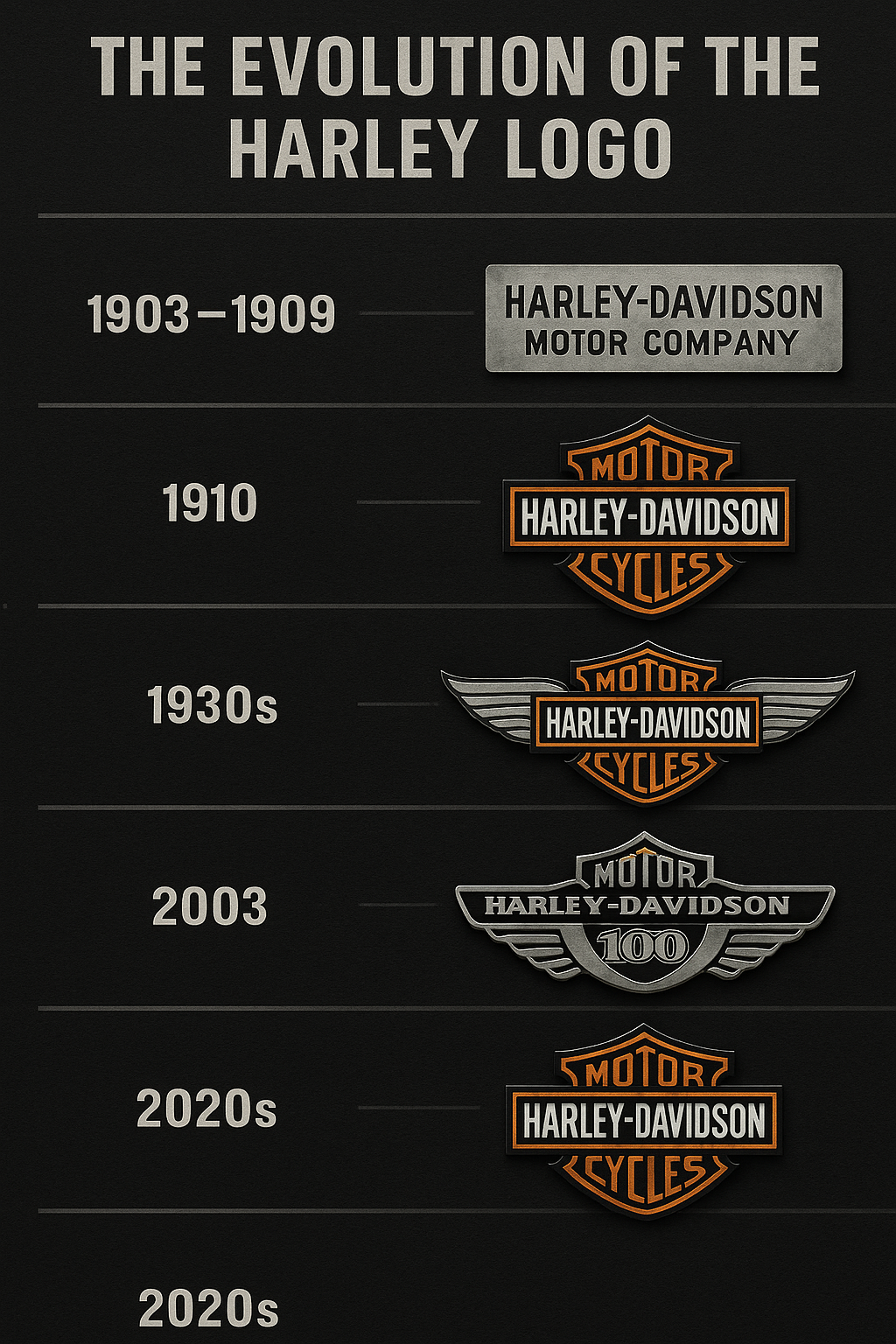
1. The Very Beginning: No Logo, Just A Name (1903–1909)
Let’s go back to 1903.
Four guys — William Harley and the Davidson brothers — were building a motor-powered bicycle in a wooden shed in Milwaukee.
They didn’t think about branding.
They just wanted the thing to run.
So what was the logo back then?
Just the words “Harley-Davidson Motor Company” stenciled in block letters. That’s it.
No badge.
No shield.
No symbol.
Just function.
It was like writing your name on your school notebook with a pen — it told people it was yours, but that’s about it.
Still, this simple beginning laid the groundwork for everything that came later.
2. 1910: The Birth of the Bar & Shield
Here comes the first real spark in the evolution of the Harley logo.
In 1910, a friend of the Davidson family sketched something special — a bar with “Harley-Davidson” across it, placed over a shield.
Why those shapes?
- The bar looked strong and solid — like a nameplate on a machine.
- The shield gave it honor, like a badge worn by a hero or knight.
They didn’t add flames or animals.
They didn’t try to look fancy.
They wanted one thing: trust.
That logo, the Bar & Shield, was registered that same year. And guess what?
It’s still the core of Harley’s logo more than 100 years later.
3. 1920s–1930s: Early Experimenting (Wings, Curves & Style)
Once the original logo was in place, Harley started having a little fun.
They tried new styles:
- Art Deco fonts to match the style of the time
- Winged versions to symbolize speed
- Slight color changes — red, gold, or chrome
But here’s the smart part:
Even when they changed things, they never dropped the Bar & Shield.
They treated it like a face.
You can grow a beard, wear glasses, or put on a hat — but you’re still you.
4. 1940s: War Time = Simple, Serious, Silent
In the 1940s, the world changed.
Harley started building bikes for the U.S. military in World War II.
Designs shifted quickly.
- Logos were smaller, sometimes invisible
- Colors turned olive green, gray, or black
- Shiny finishes disappeared — no reflections allowed in war
But even without loud branding, the Bar & Shield remained.
Soldiers knew what bike they were riding. And when they came home, they remembered.
Harley’s logo had become more than a brand.
It was a memory of bravery, loyalty, and home.
5. 1950s–60s: Rebellion and Rock ‘n’ Roll
Now we’re getting into the golden age of American culture. Elvis. Greasers. Leather jackets. Route 66. Hollywood bikers.
Guess what bikers were riding?
Harleys.
And what logo was on those gas tanks, jackets, and belt buckles?
The Bar & Shield.
But it wasn’t just a logo anymore.
It was a badge of identity.
- If you wore it, you weren’t just a rider — you were a rebel
- You didn’t follow the rules — you made your own
- You didn’t just want a machine — you wanted freedom
This phase in the evolution of the Harley logo transformed it from a company mark into a cultural icon.
6. 1970s: Custom Culture, Creative Logos
By the 1970s, Harley riders were customizing everything — paint jobs, handlebars, saddlebags, even logos.
Harley responded by:
- Creating new stylized tank emblems
- Adding script fonts and artistic touches
- Introducing model-specific badges for Sportster, Softail, and FX Super Glide
The brand allowed more freedom, more design flair. But always…
The Bar & Shield stayed somewhere in the mix.
This was Harley’s way of saying,
“You can make it yours — but you’ll always be part of this family.”
7. 1980s: Fighting Back with the Logo
Harley faced serious trouble in the ’80s.
Japanese motorcycle companies were making faster, cheaper bikes. Harley was losing ground. American riders were switching sides.
So how did Harley fight back?
They leaned hard on their heritage — and their logo.
- The Bar & Shield was everywhere again
- Banners like “Made in the USA” wrapped around it
- The color combo of black and orange returned in full force
This wasn’t about design anymore.
It was about loyalty.
The logo became a shield in more ways than one — defending Harley’s place in the world.
8. 2003: 100 Years of Harley = A Winged Masterpiece
2003 wasn’t just a new year. It was a milestone.
Harley-Davidson turned 100.
To celebrate, they created a special edition of the logo:
- The same old Bar & Shield
- But with silver wings stretching out from both sides
- A “100” badge added proudly in the center
It looked powerful. Confident. Historic.
Collectors still hunt for this logo.
And when you see it, you feel something.
You think: “This company didn’t just survive. It soared.”
9. 2010s–Today: Simple, Flat, Everywhere
Welcome to the digital world.
Everything’s getting sleeker, flatter, cleaner. And so is Harley’s branding.
Modern updates include:
- Flat design for screens and mobile apps
- A casual, compact “HD” version for streetwear and caps
- Subtle tweaks for websites, social media, and ads
But even now, the evolution of the Harley logo has stayed consistent. They haven’t replaced the Bar & Shield. They’ve just reshaped it for the screen.
Why? Because that shape is trust, freedom, and legacy — in one tight, powerful symbol.
Why the Harley Logo Still Hits Home
Let’s be real for a second.
This isn’t about graphic design anymore.
This is about what makes a logo live for over 100 years.
Here’s why it still works:
- Simplicity — easy to recognize at a glance
- Consistency — it never abandoned its roots
- Meaning — it’s not just pretty; it stands for rebellion, honor, and independence
- Ownership — when riders wear it, they own it. It’s not a product — it’s a part of who they are.
Frequently Asked Questions About the Harley Logo
Q1: What exactly is the Harley-Davidson logo?
The Harley-Davidson logo is a rectangular bar featuring the brand name “Harley-Davidson,” placed atop a shield. This combination is known as the Bar & Shield, and it has symbolized strength, loyalty, and freedom since 1910. According to Wikipedia, it’s one of the most recognized brand marks in motorcycling history.
Learn more at ridethebikes.xyz, where we dive into iconic bike brands and their design legacies.
Q2: Why hasn’t Harley-Davidson changed its logo in over 100 years?
Unlike brands like Pepsi or Apple, Harley-Davidson has kept its original identity intact. Riders don’t want reinvention — they want authenticity. The logo has evolved in style, but its essence remains untouched. It’s more than branding; it’s biker heritage.
For further insight, check Harley’s own historical archives or our deep-dive on ridethebikes.xyz.
Q3: What do the wings represent in Harley’s centennial logo (2003)?
The silver wings added in the 2003 edition represent freedom and endurance — a nod to Harley’s 100-year flight through wars, cultural shifts, and mechanical revolutions. You can explore how this symbolism compares with other centennial logos at Wikipedia’s design symbolism pages.
We break down this evolution visually at ridethebikes.xyz.
Q4: Is the Harley-Davidson logo legally protected? Can I use it?
No — the Harley-Davidson logo is trademarked and heavily protected. You cannot use it commercially or even on custom products without explicit permission from the company. Harley is known for aggressively defending its intellectual property, as noted on Harley-Davidson’s official website.
For riders looking to celebrate the brand legally, our team at ridethebikes.xyz shares tips on authentic gear and licensed merchandise.
Q5: Is the Harley logo still popular among younger riders?
Absolutely. While the logo has seen digital-friendly tweaks (like flat design and minimalistic versions), the core Bar & Shield remains iconic. Young riders proudly wear it on jackets, helmets, and even tattoos — proving it’s a cross-generational identity.
Discover how Harley’s design legacy keeps attracting new generations at ridethebikes.xyz.
Final Summary Table
| Year | Logo Style | Key Change |
|---|---|---|
| 1903–1909 | Text only | No real logo, just a company name |
| 1910 | Bar & Shield | Official logo introduced |
| 1930s | Wings, curves | Art Deco influences begin |
| 1940s | Simple, dark | Military look, wartime bikes |
| 1950s–60s | Bold & chrome | Rebellion and biker culture |
| 1970s | Custom tank badges | Riders personalize their ride |
| 1980s | Patriot-themed | Back to roots to fight imports |
| 2003 | Winged edition | Centennial celebration |
| 2010s–2020s | Flat & digital | Modern screens, same soul |
Final Thoughts: The Face That Roared
The story of Harley isn’t just the story of a motorcycle.
It’s the story of a brand that became a belief system.
And the evolution of the Harley logo tells that story without saying a word.
- In garages, it inspires.
- On roads, it commands.
- In hearts, it stays.
Some logos are designed.
This one was earned.